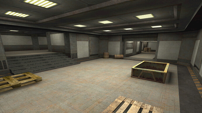
Exactly ![]()
nice textures! but there’s like 10 brushes. & what gamma is that?
??? ![]()
All I see is a door…
I am just as lost as you are to that response lmao
opened radiant!!! wot woot owtowot woo
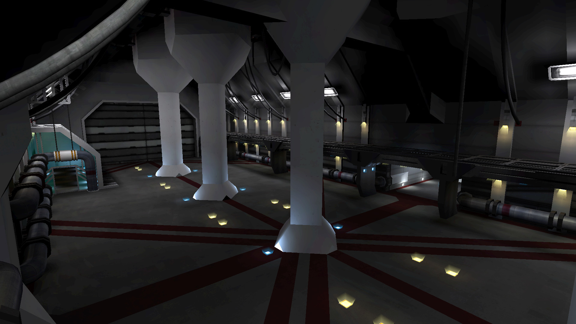
balcony thing added
lighting kind of splotchy D:
Since it got trashed away in the other thread i bring it back here ![]()
![]()
In. & outdoor -contrast / colors set. ![]()
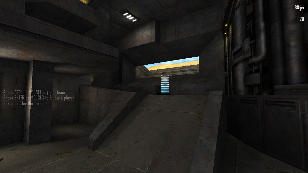
Camper’s Heaven ![]()
![]()
![]()
![]()
![]()
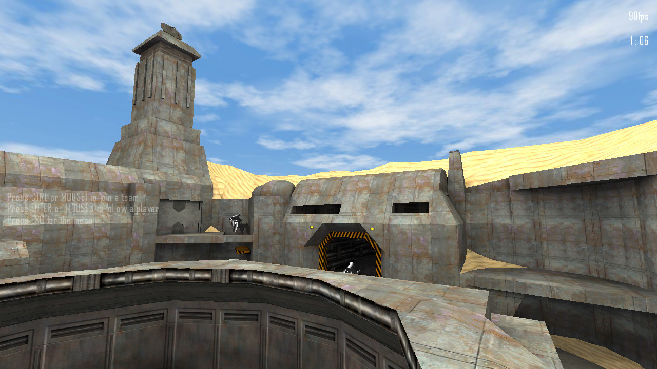
That kinda looks like a Colosseum.
hmm remarkable coincidence. I was in rome two weeks ago.
The hills in the background in these screenshots really remind me of the desert hills in Mario games, especially SM64. But the big thing that pops put at me… what’s up with that Rant model? It looks really weird.
Also, thank you for accommodating the GPub bugs. It’s nice to see that the upper ring is not actually rounded and is just clipped manually; rounded surfaces that can be wallwalked on cause the viewpoint to flip, such as the ceiling of the bottom half of mid on nano and the ceiling on Karith outside the front door of alien default.
Sandstorm inbound! ![]()
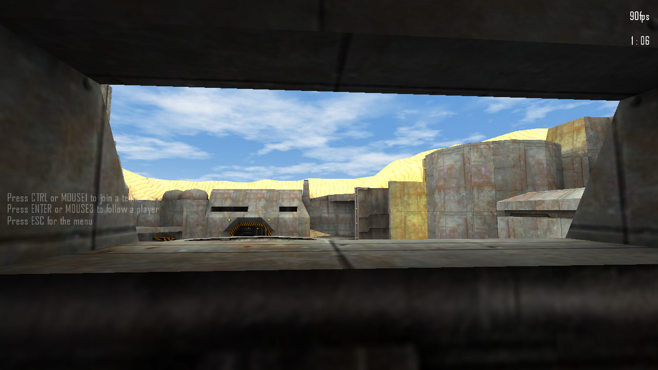
Center section nearly done ![]()
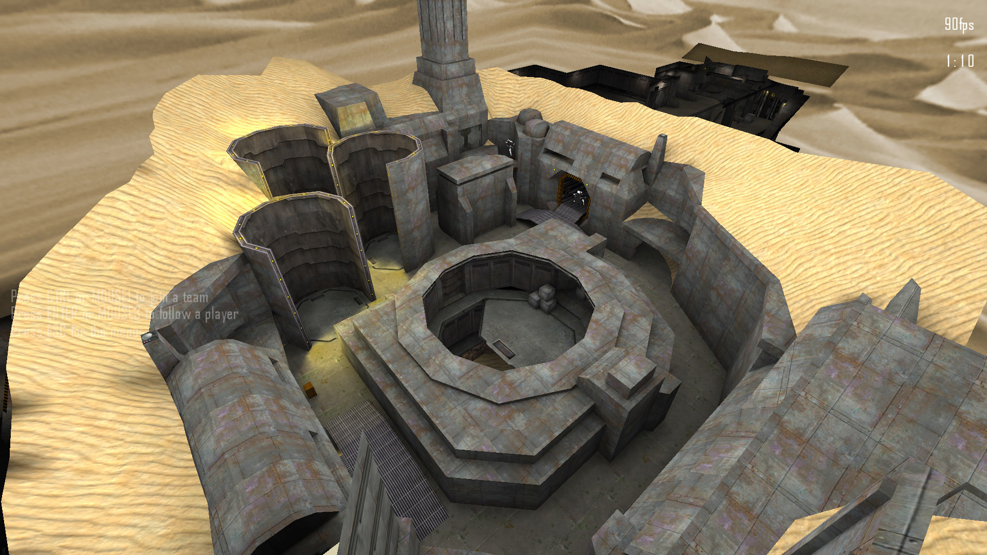
Center section done! ![]()
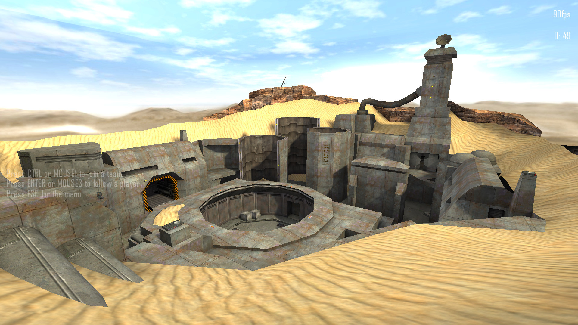
I really love this desert look. MAKE A BEACH MAP WITH THAT TEXTURE
thats looking really nice actually!
Hi all! =)
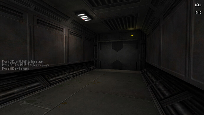
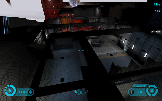
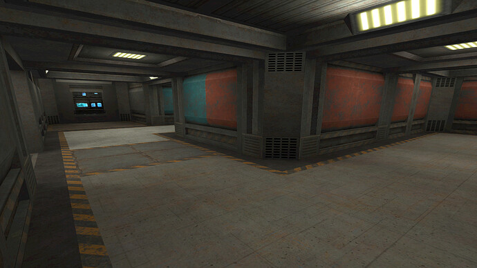
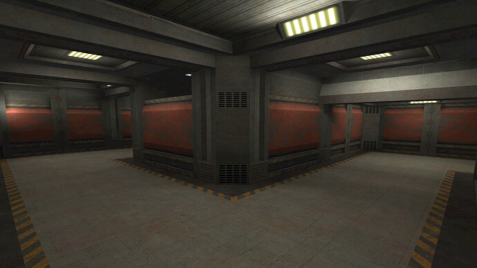
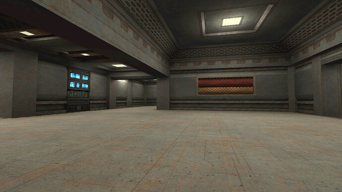
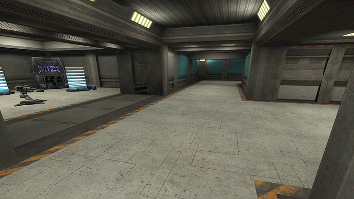
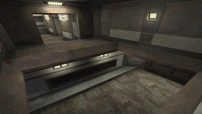
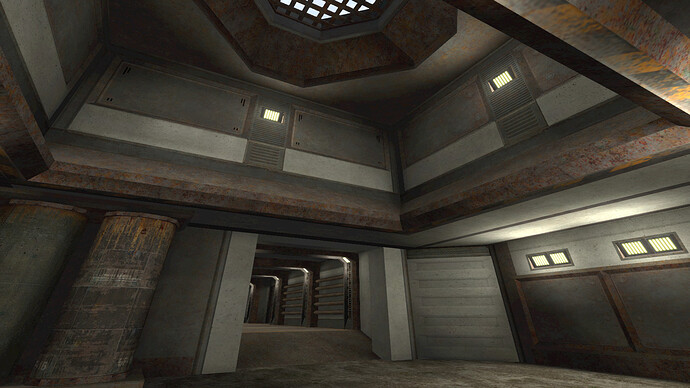
I’m new to this forum, dGr8LookinSparky sent me here. So that’s some screenies from my ‘Rusty’ map:
Map was started like in 2008 but wasn’t finished. After almost 10 years I returned to Tremulous and decided to finish it. Map was planned as simple but detailed A.T.C.S. alternative with more realistic feelings. Currently WIP. =}
