My problem with this statement is that Unvanquished has made it clear that its in early alpha and most of it’s visual assets are subject to major overhauls at any time. I’ll reserve judgement on what Unvanquished artstyle is aiming for when the developers themselves nail down a concrete vision.
It’s important to explain what “realistic” means so we can better understand what this actually means and not confuse it with “unrealistic” artstyles. I think it would be helpful if you explained this term in your own words.
To me, “realisim” is when the art imitates (to the best of the developer’s ability) objects, maps, lighting and animations (etc) that we could see behave in the real world. I use “imitate” loosely because despite many games trying to push polygon counts and fancy rendering effects to make games look “realistic”, instead artists still employ stylistic techniques to make the game look “better” over trying to make it “photorealistic”. Example:
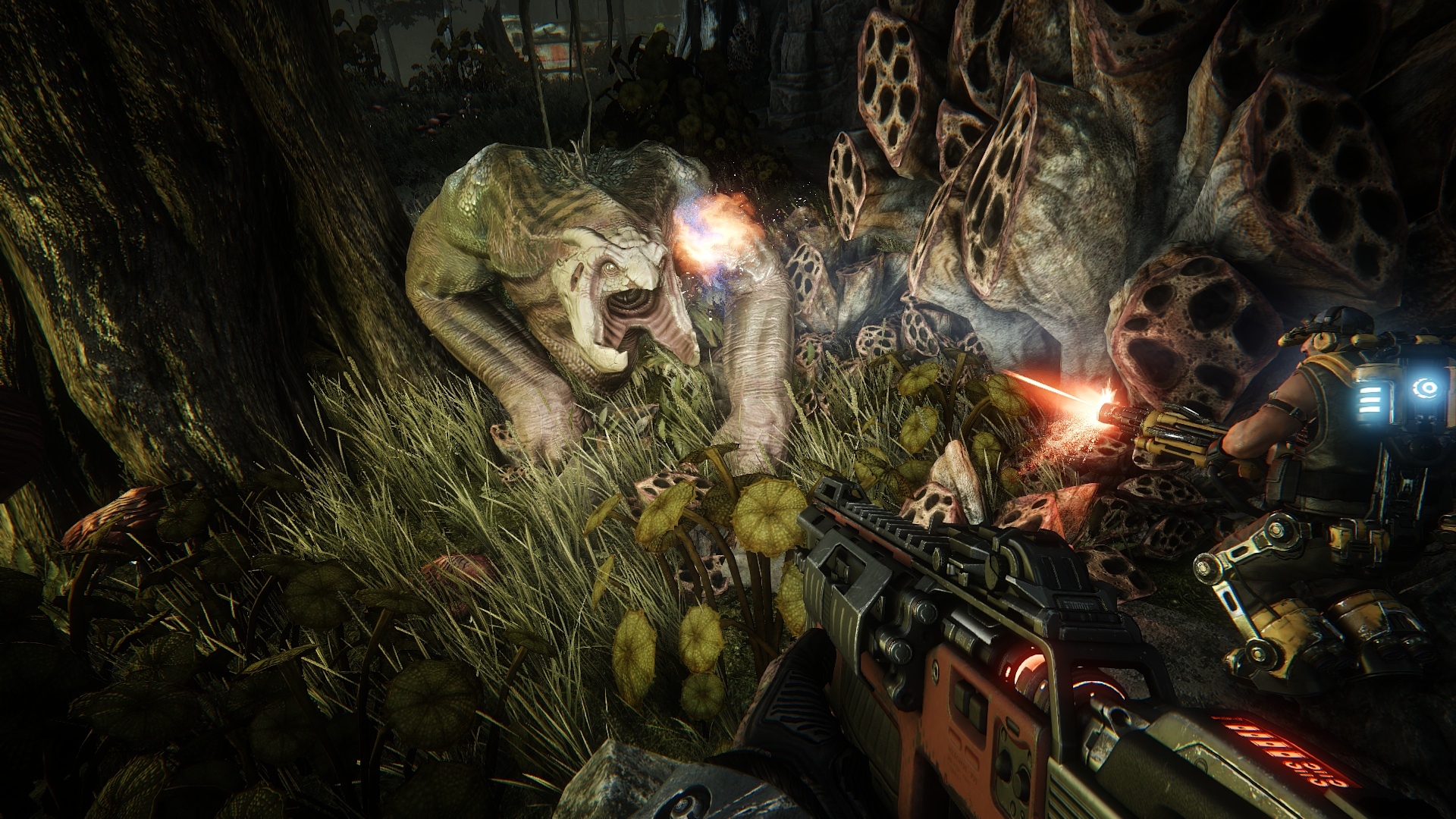
I think alot of people would look at this screenshot of Evolve (Alien team/survival FPS) and say it has a “realistic” artstyle, but we need to ask ourselves if this is truly the case. The lighting is certainly impressive and does try to behave like actual illumination, as well as the reaction it has against the Alien’s skin. However, noone would look at this and be tricked for even a second that this is “real” because if we look at the finer details, we see that the textures have a “painterly” look to them. The guns are oddly reflective, the grass seems flat, the right-sided alien vegetation use smart use of textures to give the impression that they have holes inside of them, chromatic aberration and haze are used in ways they would never appear in real life, you can see the proportions of the models are exaggerated, etc. There are things in this image that are clearly both stylized and “realistic” and the game tries to make good use of both in tandem so that the image you see would look impressive for a AAA shooter in 2015.
I wouldn’t call this “realistic” but rather “stylized realisim” like the kind you see done for big-budget movies and CGI trailers today. The reason I’m emphasizing the difference between “realistic” and “stylized realistic” artstyles is that the difference between what you can do in one compared to the other is significant.
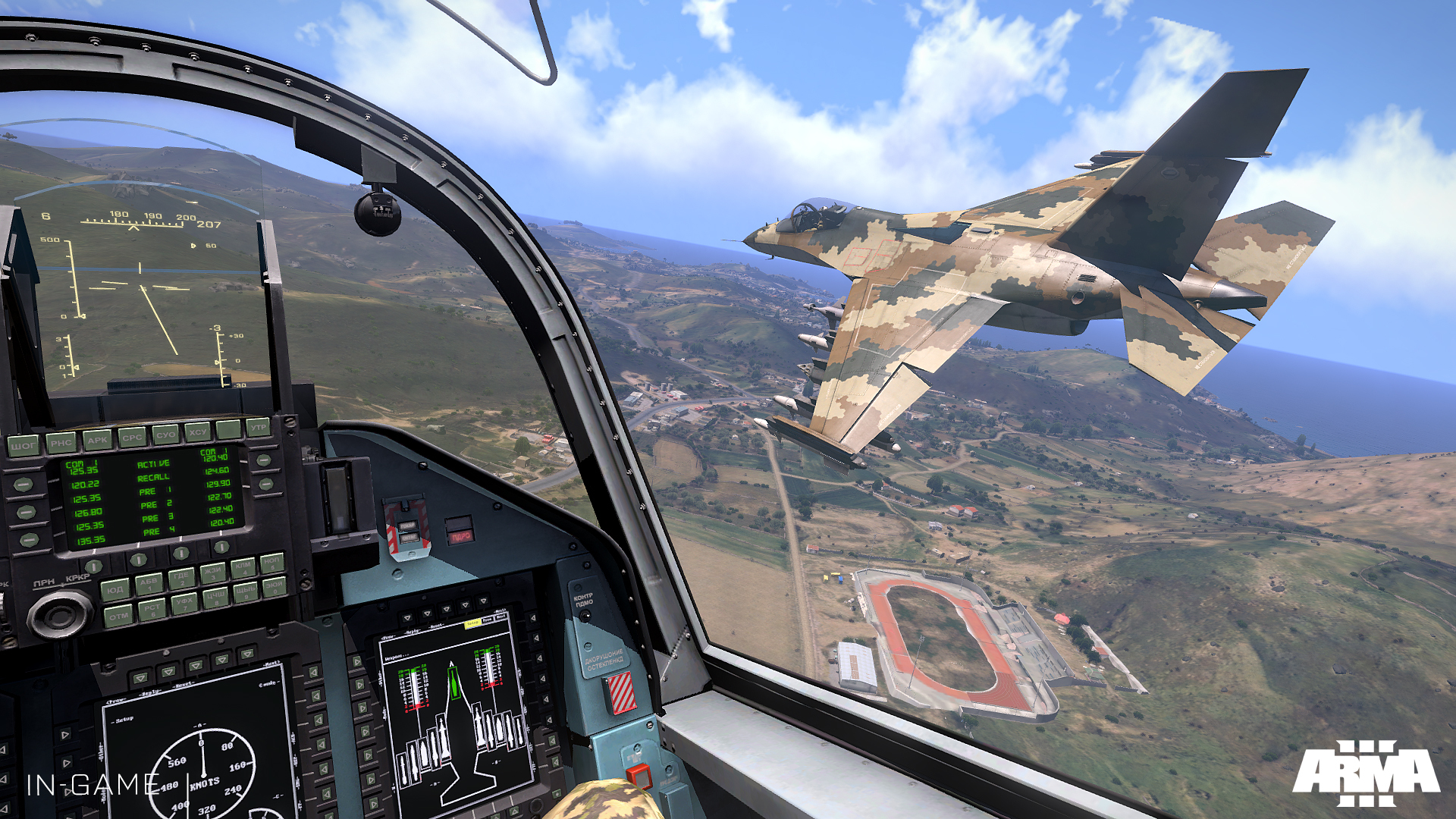
One lets you get away with exaggerating models, gunfire, lighting, etc while trying to maintain some ground in how those visuals would react against more natural lightsouces, models, sprites, etc. “Realistic” artstyle would demand that despite the limitations of your renderer, art skills, time, etc you try to imitate the real world as best as you possibly can. A good example of this is Arma 3:
To summarize my whole spiel, my argument is this: artstyle can be nuanced and we don’t have to commit to making Tremulous only look “realistic” or “cartoony”. We can still have a game with realistic lighting, weighty animations and all the rendering whistles we want, but still have exaggerated models and stylized textures that will still look good even with all the settings cranked down.
aka “BETTER GRAFIX”
We just gotta decide what exactly thats going to look like. One point you brought up is something I’d agree with:
ie. We’re going to need competent artists who are willing to balance issues like these out with the programmers.
Noone for now.