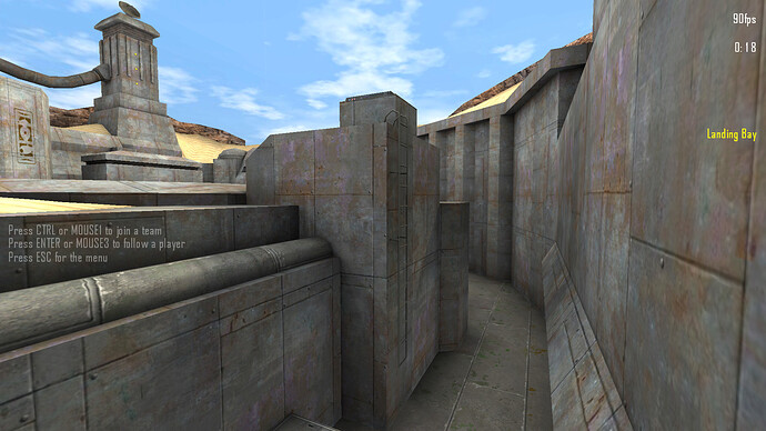
Map release: Fortification

Info: “Just a quick remake of fort5. Have fun! :kissing_heart:

TITLE: FORTIFICATION
FILENAME: map-fortification_v1.1.pk3
CALL-NAME: fortification
AUTHOR: Matth
DATE: 29.09.2016
GAME: Tremulous (www.tremulous.net)
DOWNLOAD v1.2: http://dl.grangerhub.org/base/map-fortification_v1.2.pk3
DOWNLOAD v1.1: http://dl.grangerhub.org/base/map-fortification_v1.1.pk3
DOWNLOAD v1.0: http://dl.grangerhub.org/base/map-fortification_v1.0.pk3

General license:
Everyone is allowed to play this map on their pc or host it on their server/ provide a download link.

Content:

  • to be honest: nothing of original fort5 is left but the name (a bit)

Important notes:

  • This is an UNOFFICAL remake.

  • Developing gamma was set to 1

  • It’s not supposed to hurt anybody’s feelings.

  • You can like it or not but please respect artistic freedom.

  • Insulting, trollish behavior / comments will be ignored

  • Do not expect any of your ‘suggestions’ to be implemented at any time.

Changelog:
1.2:
-sound problem fixed
-texture errors fixed
-bp reduced to 140
-brushwork enhanced

1.1:
-light changes (now build around gamma 1.3)
-texture errors fixed
-wallwalk playerclips extended
-entity changes
-brush errors fixed
-ladder fixed
-thin-door lip reduced

1.0:
-initial release

5 Likes

Fortification version 1.0 is now available to play on the GrangerPub server, the GrangerClub server, and on the test7341 server.

2 Likes

Before I start this post, I just want to say I don’t mean to offend you in any way with this post. This is just a list of all the obvious bugs I’ve seen as well as some suggestions to make gameplay smoother or better. This is basically the same kind of list I made for MaeJong before Sharp was even put on the GrangerPub server.

Overall, I really like this map. For the most part it’s well designed, it looks great, and I think it will probably have alright gameplay too, except for a few small things. As always, there are a few optimizations and/or bugs that I would like to point out.

  • One large thing is that the clipping in the outside area feels extremely unintuitive; just by looking at the walls of the outside area I was completely unable to predict which areas I could get to or not get to. Example 1, Example 2. Also, there are some spots outside where Dretch can hide and be unkillable or nearly unkillable against S1 and maybe even S2 humans. Example 1, Example 2. A strong example of it being unintuitive is that the same spot on opposite sides of the outside don’t even have the same clipping, even when the exact spots are symmetrical. In this spot above the entrance to each base, you can move further back on the human side than on the alien side: Alien side, Human side.
  • Lights are solid objects with zero clipping, which messes up wallwalk, pounce, and just in general impedes movement. Example 1, Example 2. Best and easiest fix would be to just make them non-solid objects, and since they barely stick out of the walls/ceilings it wouldn’t look weird when walking over them even though the light could be inside the alien model. Harder and less effective method is to add ramp clips around them (ATCS did this).
  • This little ridge in the upper hall from each default base causes significant problems for wallwalking. When trying to go from the ground directly to the wall, if you don’t jump to a part of the wall above it you may just get stuck and not be able to wallwalk up the wall.
  • In that same hall, anti-wallwalk clipping from the outside area goes through the ceiling for a large portion and prevents wallwalking on the ceiling. For the human side, this is a large area. Picture 1 (near the door to the outside; you can’t wallwalk on the ceiling anywhere inside the hall from the door to a place halfway down the hall), Picture 2 (somewhere in the middle), Picture 3 (the last spot you can wallwalk on the ceiling coming from human base). For the alien side, this is a big area, but somewhat smaller. Picture 1 (last spot you can wallwalk coming from the door to outside into the hall), Picture 2 (last spot you can wallwalk coming from alien base).
  • This ladder in mid messes up wallwalk when coming around the wall on the left side (as drawn by a shitty arrow). When coming around that corner, the ladder is in such a spot that it flings Dretches (and maybe other wallwalkers) off the wall. Easy solution: move the ladder about halfway across that segment to the right, and maybe add ramped clipping so wallwalking across the ladder is less jarring. Also, for humans, it would be nice if it was extended or had a little clipping at the bottom so humans who are too close don’t bonk their heads when trying to jump onto the ladder. As it is, if they bonk their head, they waste a third of their stamina for nothing.
  • This door in mid is extremely slow. It takes around 2 seconds to get through it if you don’t jump over it. This is exacerbated by being a door that goes downwards instead of upwards (which wouldn’t work since there’s nothing above it to cover it) or sideways (which would work, just like the doors outside which lead to the indoor elevators).
  • Speaking of the doors outside which lead to the indoor elevators, the alien side one doesn’t have a texture on the side that is visible when it is open. Proof. It would also be nice if all the doors went in all the way instead of sticking out, so that people don’t get stuck on them when trying to walk through the door, especially the extremely thin doors from outside to the indoor elevators.
  • In this case it’s an unimportant optimization, but since I was checking out doors I noticed that this door in human/alien base is not clipped to be flat. In this case, since it only gets thinner in the middle, it doesn’t really matter much, but human can crouch under the bump and not be able to stand up (as seen in the picture).

That’s about all I have for now; the most important thing to fix is the clipping that prevents wallwalking in the upper hallways, as that severely impedes gameplay. I meant to check for hovel bugs, since I saw a few potential locations, but I was unable to test it locally and I don’t have devmap for testing it on the club server. When the major bugs are patched out, I probably wouldn’t mind having this in the rotation, although I’m not sure yet since I haven’t had a chance to test out actual gameplay on the map. I will say that I think this is by far your best map yet (ignoring the major bugs).

8 Likes

Thx sparky :kissing_heart:

1 Like

@Menace13 I don’t think that Matth cares. As always lol

1 Like

Nice map Matth!

I do like the original fort5 so I am happy to see a remake. I look forward to playing this in pub and possibly scrims and I hope you listen to the communities feedback and adjust accordingly.

I floated around your map for 20 minutes or so and have some feedback to give you which you can choose to take or not, although keep in mind that my analysis on the gameplay is purely assumption as I have yet to play this in a pub setting. I would also like to start by saying that I think Menace gave some really great feedback and I agree with most if not all of his points.

I really like the look and design of the bases, they can lead to much more creative base designs. The textures in most areas are a welcome improvement although I would say they are not quite up to the standard of quality I am used to with your maps (tremor remake).

Textures

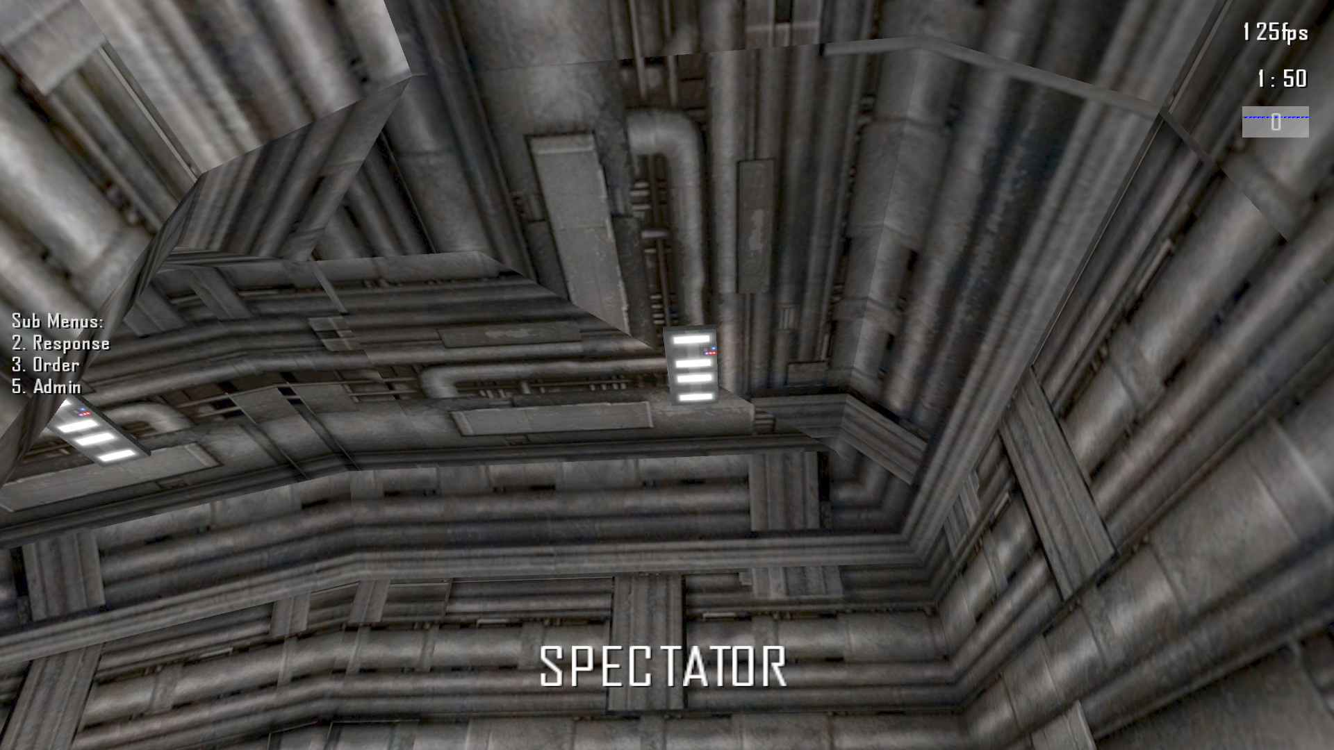
Overall the textures are very good although I very much disliked the ceiling texture used in the mouth of the bases and the underground area. It’s identical to the wall texture, overlaps, and looks a little stretched. It starts to burn my eyes a little and when you overuse textures like this it can lead to people getting lost within the map and start to get bored. Additionally it makes the lights look a little out of place and leaves clear indentations where you have laid the texture onto the brush.

Example I
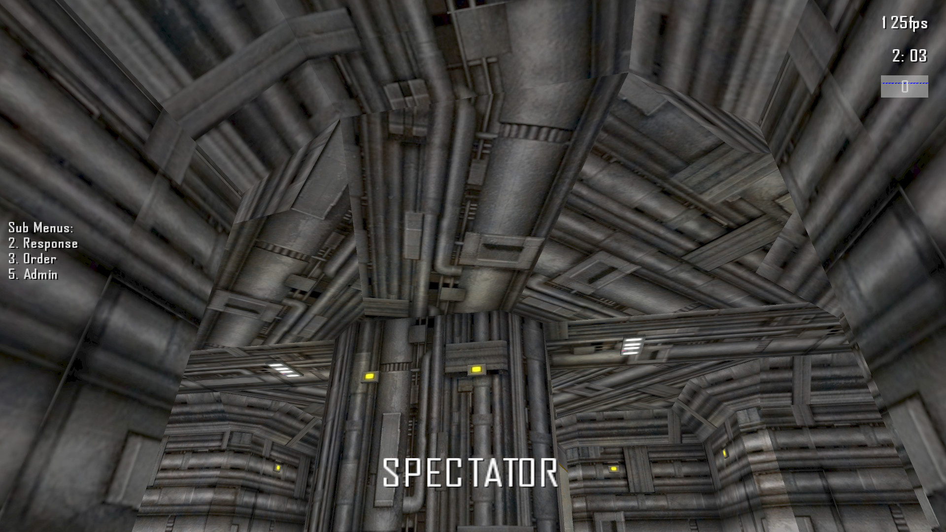
Example II
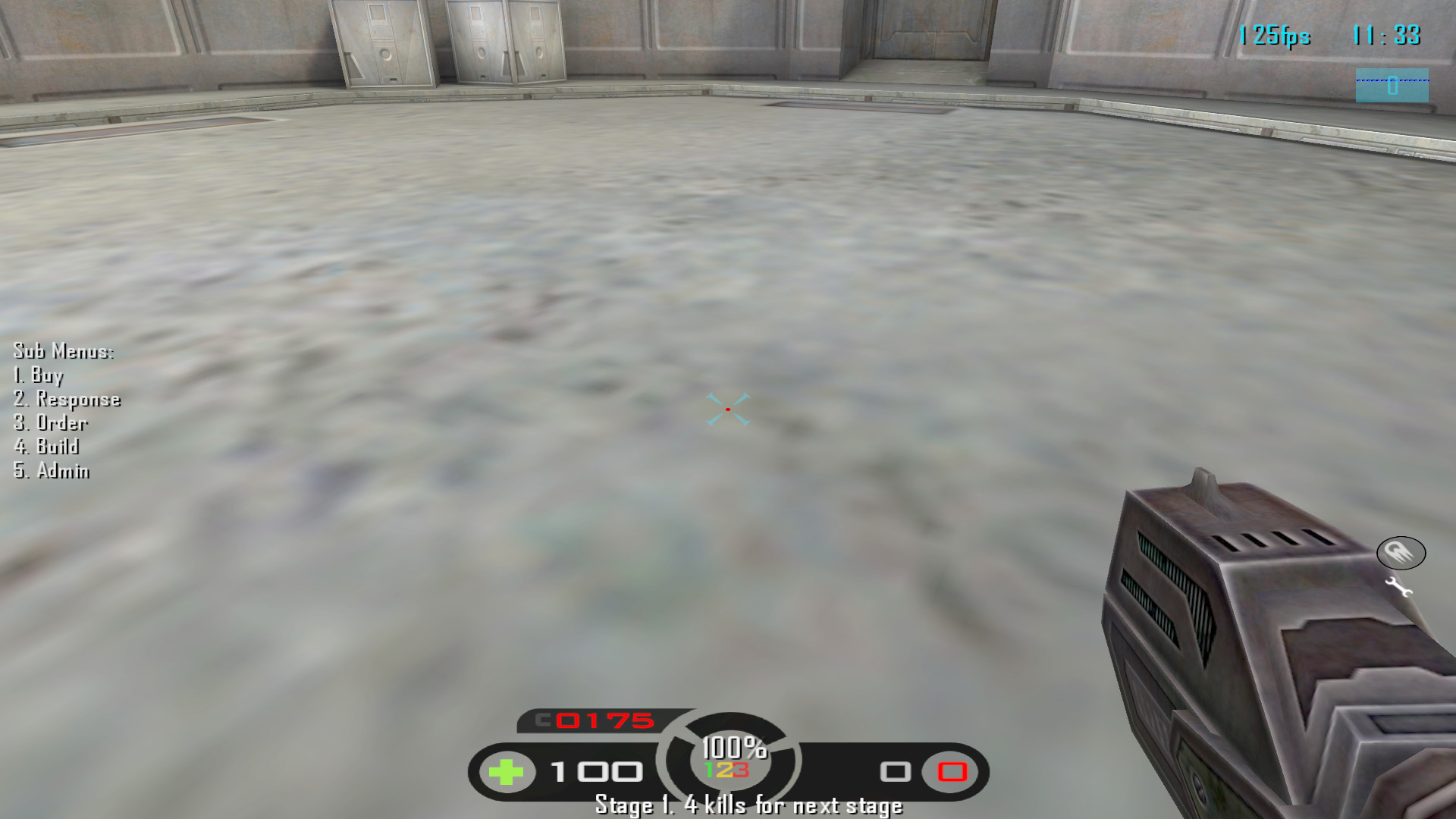
The middle area floor texture is horrendously bad (although I later realise perhaps why) I am sure it can be improved

Example I
Example II
Gameplay

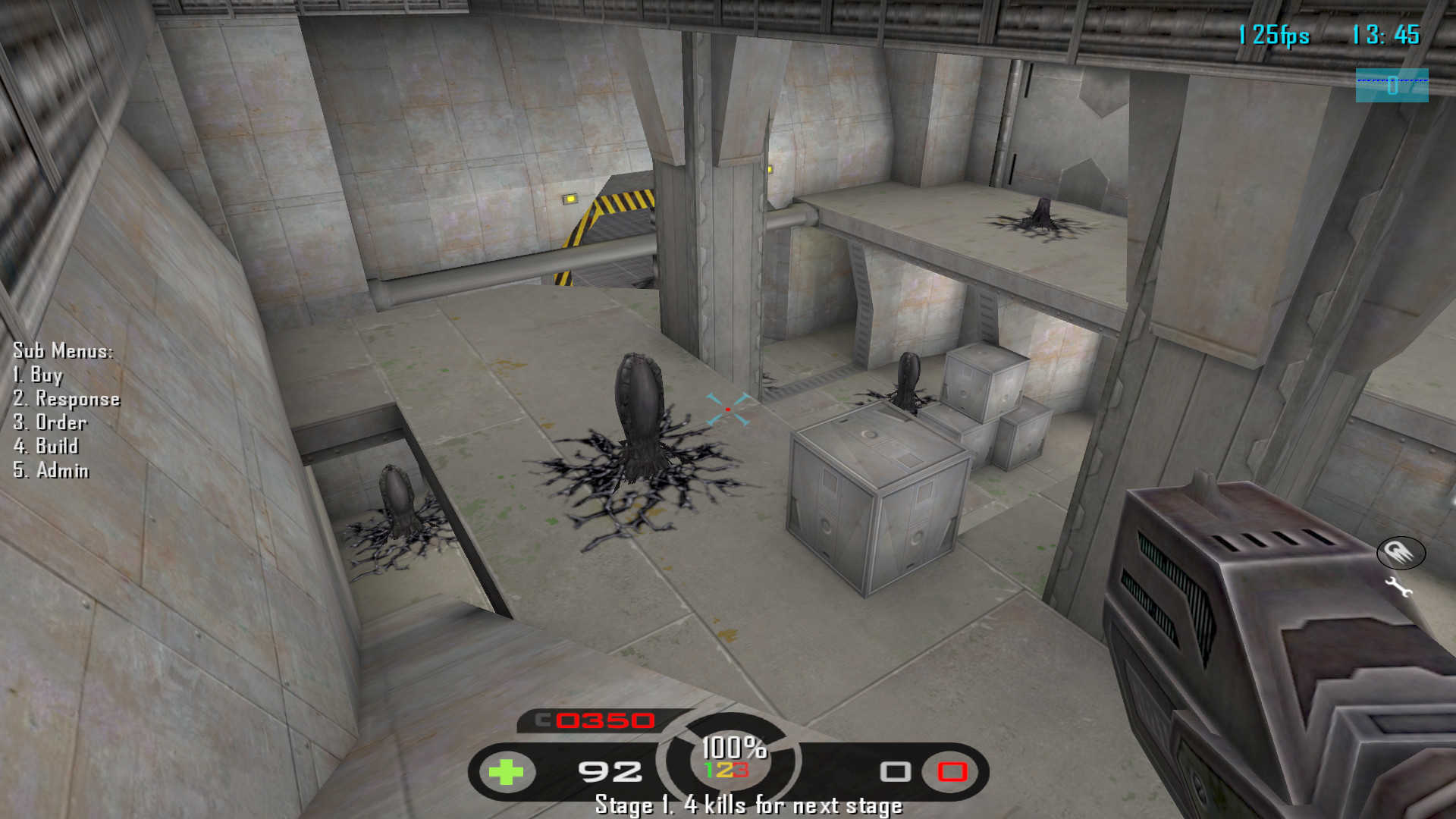
Please fix the alien layout so this is not possible (all 3 eggs in vision with a huge height and positional advantage). I would be willing to make a balanced layout for you if you like. (narrow edge also suffers with it’s layout)

Example I
My early concerns with the gameplay was “Why the fuck would you want to use the underground?” The upper areas lead to the bases considerably faster, provides advantages for both races to work with and overall look like more fun and dynamic gameplay. (along with nicer textures)

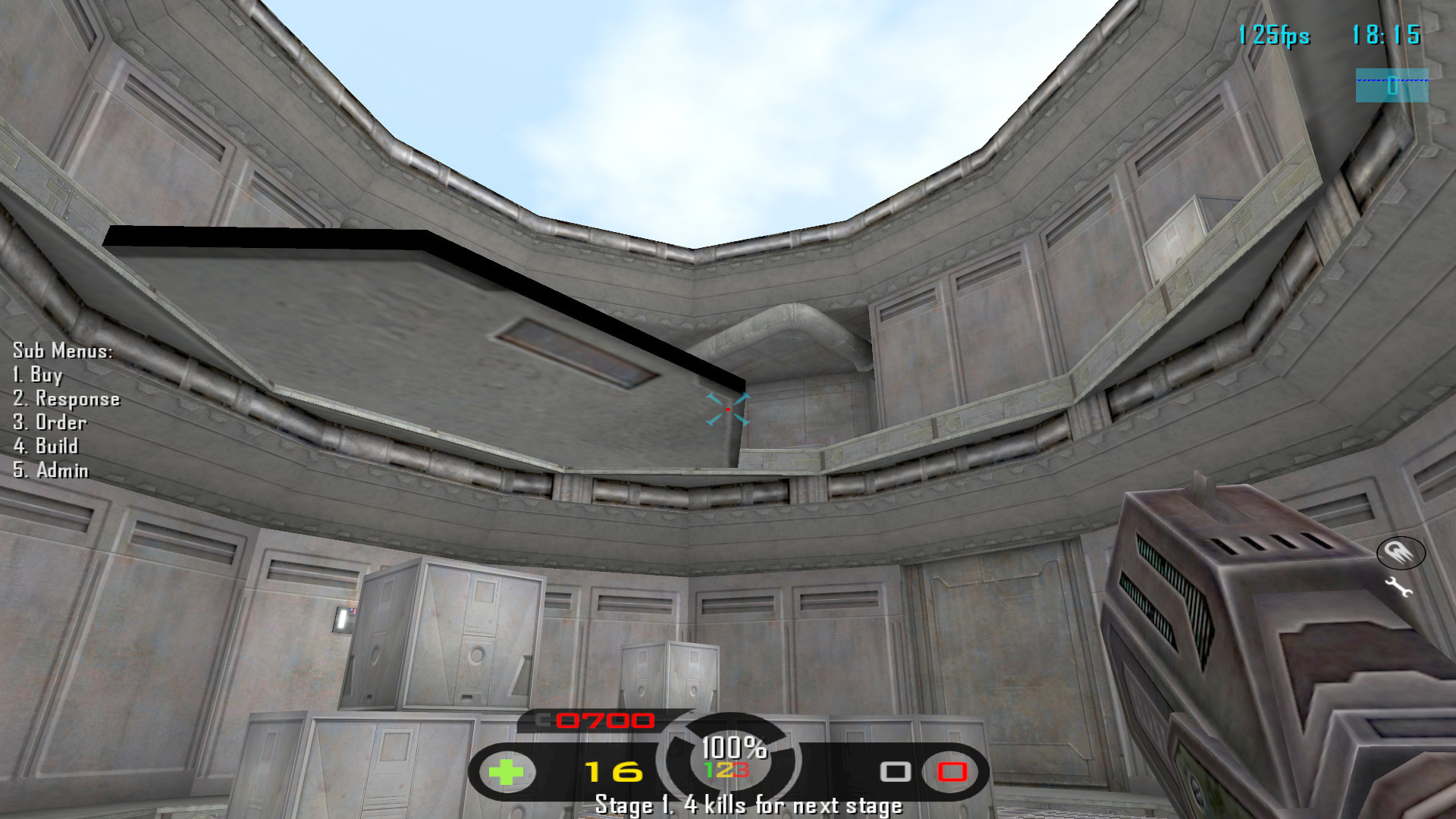
However, I noticed that using the button in the underground hub can actually open up the floor of the bunker outside (which kind of explains the ugly ass texture)

Picture for those who are wondering wtf im talking about
This definitely opens the map and allows a lot more diversity in which route you take to the opponents base, with similarities from the map nano.

From a gameplay standpoint I do have some concerns.
It might be perhaps better to have the button work in reverse (where pressing it will close it for a certain time period) and then having it open by default at the start. (This would allow people to use the button to cover their retreat from above) This zone also greatly favours aliens as there is only one way out of this hole should humans fall down it and controlling the button hub is likely easier for aliens.

Misc

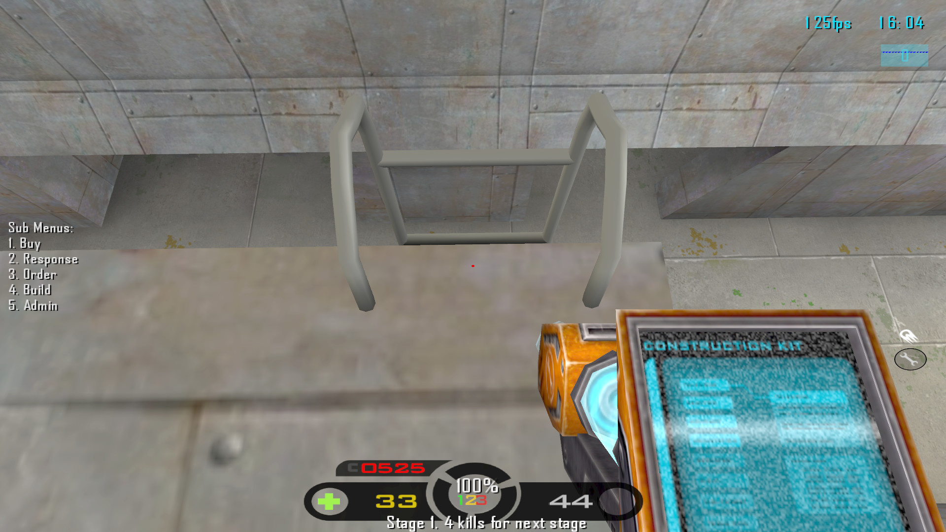
Besides the ladder improvements recommended by Menace I would ask that you make the ladders more noticeable so that it is more intuitive to the average player to use them. The grey blends right in with the textures.

Additionally climbing down the ladders is quite difficult due to the little archs present at the top which stop you in your tracks. You have to approach it at a certain angle and literally jump down it.

Example I
Bugs

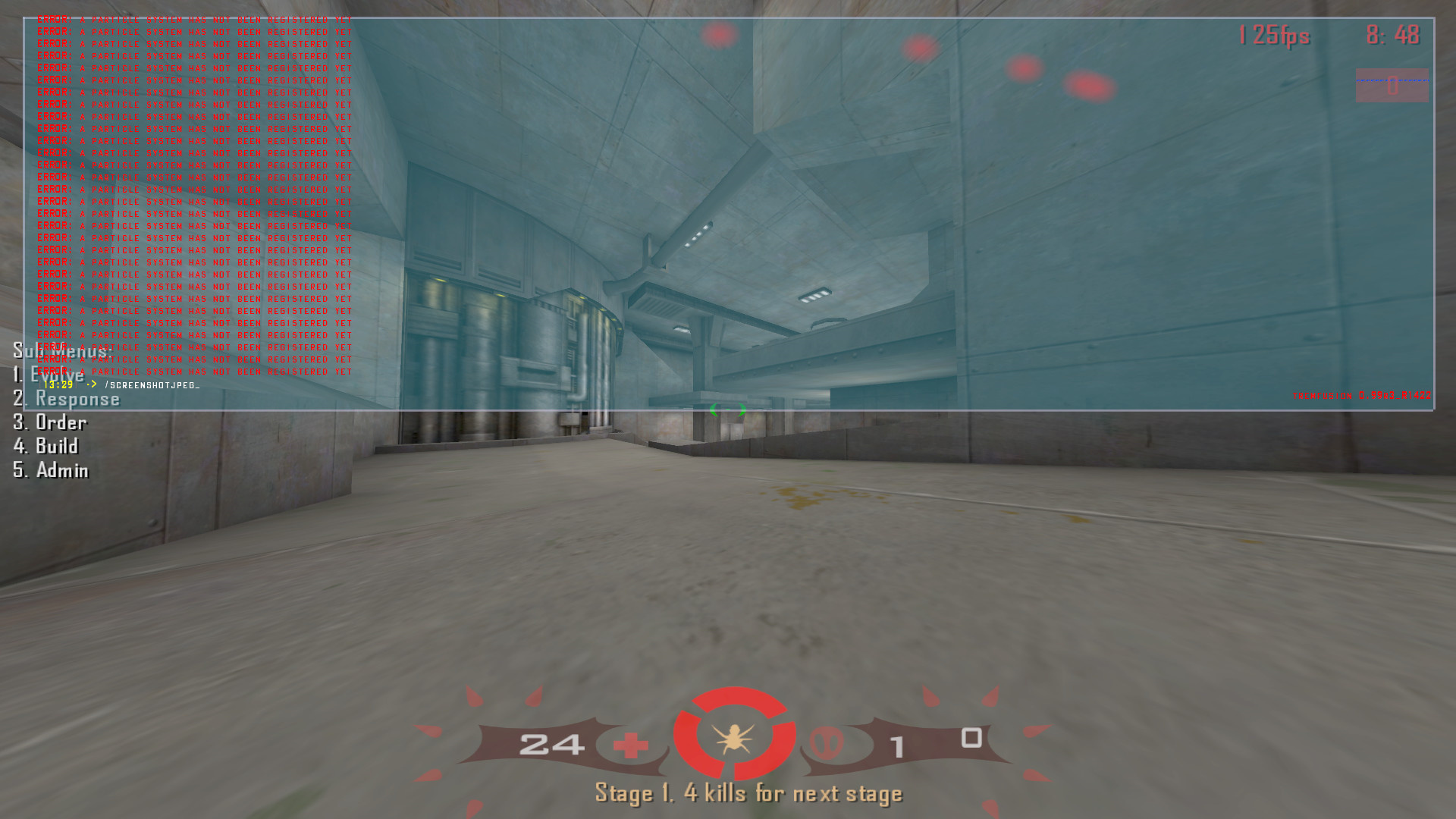
When smoke loads on turrets, acid tubes fire and buildings explode you get spammed with this error. (tested locally and on the club server)

Example
Another bug is when you open the middle area with the button it can never be opened again (one time use). Either that or it has an insanely high cooldown. Further testing confirms the latter (gameplay issue)

Thanks for the map! I look forward to seeing any updates/future work from you.

2 Likes

Aprox. between 600 to 720 second is the cooldown. (10 to 12 mins)

Considering it stays open for only 10 seconds, it’s a very brief window that you would experience on average 3 times a game.

Interesting mechanic that could turn out quite fun.

I’d also like to bring more attention to the bug which involves the repeating “particle error”. @Matth While all the changes I mentioned are at your own discretion to adjust or not, with this bug it’s borderline unplayable for certain clients. =/

Since all your screenshots are very overbright, what is your r_gamma setting?

I was using r_gamma 1.5 in Tremfusion, although I usually use r_gamma 1.7 in FSM.

First of all: thank you for your reply. :+1:

Since Tremulous is an old game and many users are using low-end computers i have to problem with low-res textures. Its a tradeoff. Read my last point to comprehend.

Its boring to present players a perfect layout. Its a basic layout to give aliens a basic protection. Everything else lead to patronise. Ofc i can create a secure stronghold but thats not my target.

Diversity. Also it was part of the fort5 layout. In general its pointless to argue about more or less ways to go to a certain place. If you don’t want to use it then don’t. After time opposite team will notice that and destroy your base using that way.

Its a platform door. hint: landing bay → landing → planes → bay → door hmmm
I’m sure this platform door can make this map very interesting. Maybe the way how players can open it should be changed…

and a bunch of other maps. Try not to mention other maps in that way because you make it look like i copied something of nano just because its ‘rounded’. Its like saying: ur map has a door, map #42 has also a door. YOU COPYCAT!!!111
Btw the door, after it has been activated, is closing and can only be re-activated after 300 seconds.

Actually there are 3 ways out. Not to mention: humans can use jetpack. After 20 minutes playing u can’t really say anything about HOW this or that place will or IS working out for h or a (you mention this yourself in your intro). This will emerge after many good games.
Even IF it favors aliens, what about zones that may favor humans? Do we really want to make everything equal and boring like a giant boxmap just because THEN we can say: no favorization at all. I would agree if it would be an huge advantage for aliens but at this point i cant see that.Also: only adv goons can jump out that hole.

If you can’t see them in that screenshot then you need glasses. Sorry :smiley:
Lets make signs with ladder symbols on them to tell our 1000 new players where they are.
Reminds me of this: https://www.youtube.com/watch?v=W1ZtBCpo0eU
It may also a lighting problem since that area looks to me like this:

Yes its abit hard to do. I will try to unblock it.

Never had this problem. You sure its not a problem with your copy? You tested it on ghub or local?
I didn’t add any new particlesystems nor used any existing with new objects.

First of all i did this map very fast. Its a speedmap if you will. Also i have learned that high quality mapping is not suitable for tremulous in many ways. Most important is: players with slows pc’s lack performance to run them smoothly. Another is that (my opinion) average trem players are used to play ‘budget’ maps. Its probly because of the the stock maps that look that way and if you are used to them then it feels cosy to play a map that is done in that way. Remember: if you played 70% of your tremlife ATCS then you expect something similar. I call it ‘Tremulous-Artform’.

1 Like

I made this map using standard gamma. Means: /r_gamma 1.0
Brings up the question: what gamma should be used to map in general? …

I think the majority of players use a gamma of 1.5 or above, but I could be wrong.

Also, I didn’t mention this in my original post, but there’s a weird thing with the elevators. If you press the button to make them go up, then stand on them, they don’t go down because you’re standing on them. So you have to press the button, wait for them to start going down, then get on them before they go too far down in order to avoid fall damage. Not sure if that’s intentional or not.

I’m not talking about adding more structures, just about rearranging the egg positions so the spawning aliens aren’t fodder. I’ll tell you now with that current layout it increases humans win rate by at least 20% and an experienced team/player will heavily exploit it.

I understand and thank you for considering other players when making your maps. I just wanted to point out that the particular textures in question were a little out of place.

In the original fort5 the underground area is shorter than in your remake and so provides a good route to travel between bases if you want to remain hidden. Travelling around in tremulous is really boring.

I agree it’s an interesting feature but could possibly use adjustments (we would need to test it in a pub game) I imagine that adding another button above the landing bay could be an improvement so it can be opened from both sides.

I was not in anyway making that assumption. I was merely expressing from a players standpoint how the flow of the game may play out due to this feature. I am predicting how it will play out and to do that I need to compare from past events or in this case maps.

Keep in mind that the center of the map is often where the most action occurs and control of that area is most influential. Especially when that centre area is essentially a hub where everyone must pass through at least once to get to the enemies base. However, yes; generally a mapper should strive to create areas that favour certain races and vice versa.

People with poor eyesight and those requiring glasses play video games. I was hoping you would accommodate those and provide assistance.

Thanks!

Tested locally and on the club server, @Shuffle confirmed he got the same error.

While 1.0 gamma makes the game more aesthetically appealing, increased gamma or lightmap undoubtedly provides a competitive advantage by allowing you to see aliens more clearly. I imagine most players play within 1.3-1.7, personally I use 1.7 or even 2.0 on your dark maps.

I noticed this too, I think the original fort has something similar.

I think it’s a side effect of the “door-like” movement of the platform (going up automatically when a player stands on it). The original fort5 did not have a button at the top to make the elevator go up, but if you ride it up it would not go down until the player gets off the elevator for around a full second. It just seems weird to have a button make the elevator go up when you can’t ride the elevator down until it starts going down.

Since your reply is free from devil i thank you for your reply! :+1:

Since the limitations of the q3 engine, designers are forced to set up barriers to limit the players movement. In this case there are invisble, slick walls. I didn’t want to put an electrical fence around the map. Many maps have this ‘problem’.
I think its interesing for both sides to find all these spots and think about if its a useful spot or not. esp. aliens may have an advantage here.

I was able to use jetpack and shoot those spots. are you sure you didnt fell through a structure somehow?

Fixed. In the next version it will be the same.

Fixed.

Fixed. (was lot of work to fix all that btw)

Fixed.

I couldn’t reproduce this problem. Works fine for me.
The ladder is now closer to the bottom.

Its now traveling sideways[quote=“Menace13, post:3, topic:2708”]
the doors outside which lead to the indoor elevators, the alien side one doesn’t have a texture on the side that is visible when it is open
[/quote]

Fixed[quote=“Menace13, post:3, topic:2708”]
on them when trying to walk through the door, especially the extremely thin doors from outside to the indoor elevators.
[/quote]

Denied. Go outside walking leftways. That way u wont get stuck. I never got stuck on that door. Even with goon you can go through it easily. Also: if i would change it it will result it: making more polygons to create a shaft for the door otherwise it simply wents in the wall and ppl would say WTF BUG! Again is a tradeoff.

I couldnt reproduce this stuckness but found some error textures. Anyways walking back frees you from not being able to stand up. At this point i don’t see a bug in this.

1 Like

They move up by just standing on them (ground). If you are on the platform u need to push the button to make the platform come up. It will go down after some seconds by itself.

Could that be done in a way so that it doesn’t break from immersion? What I mean is having invisible geometries block you, and forming “compartments” that you can “hide in”, feels kinda out of place. Perhaps have it so that those boundaries near the intersection with the wal-lwalkable parts of the map are visible in some way?

Something else of interest that I don’t know if it should be “fixed” or not is that you can build on that bay door so that when it opens the buildables drop, this could be a problem, or it could be fun :slight_smile: .

How? By using a fence like in ATCS? Ofc the sandstorm pushing you down would make sense but try adding all these entities…

Definitely fun! xD

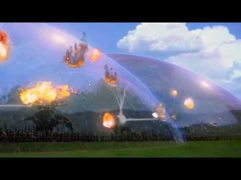
Maybe a dome force field?

Idk, I may have to think about it more :slight_smile: .

2 Likes