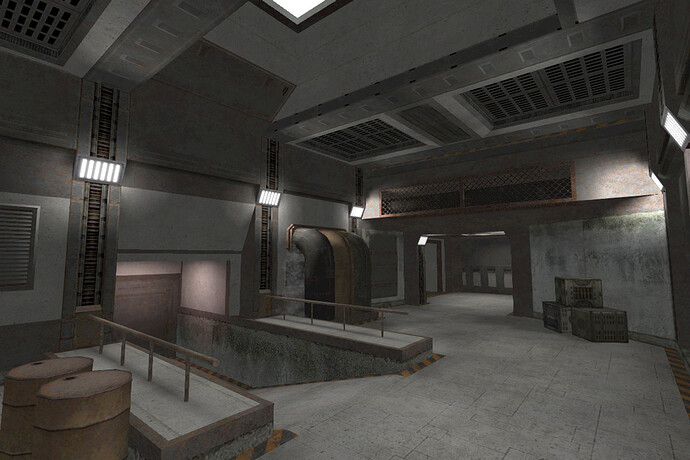
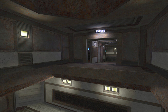
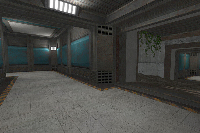
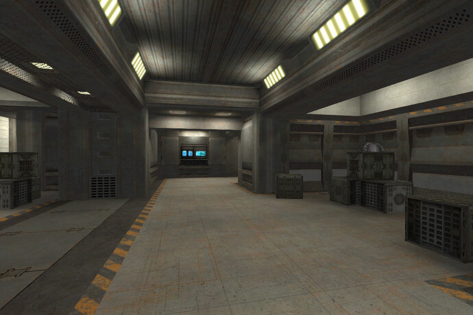
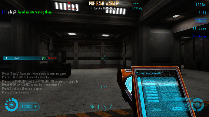
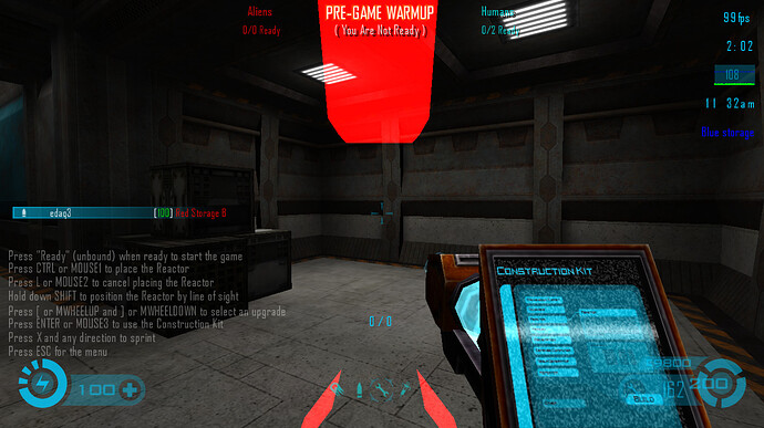
Map: Rusty (WIP)

Intro: “This map was started in 2008 but then abandoned for 9 years. And now I returned to Trem and decided to finish it. I hope you’ll enjoy this map.”

TITLE: [color=#FF4444]Rusty[/color]
FILENAME: map-rusty-b2.pk3
AUTHOR: CATAHA / K[color=#FF2222]a[/color]ty
DATE: 07.12.2017
GAME: Tremulous (www.tremulous.net)
DOWNLOAD:
Beta-1:
http://dl.grangerhub.org/files/gh_servers/base/map-rusty-b1.pk3 [17.9Mb]
‘Save as…’ mirror: http://www.krond.ru/Download/Tremulous/Rusty/map-rusty-b1.pk3 [17.9Mb]
Beta-2:
http://dl.grangerhub.org/files/gh_servers/base/map-rusty-b2.pk3 [18.3Mb]
‘Save as…’ mirror: http://www.krond.ru/Download/Tremulous/Rusty/map-rusty-b2.pk3 [18.3Mb]

Thanks to Krond for providing host for initial map download.

Content:
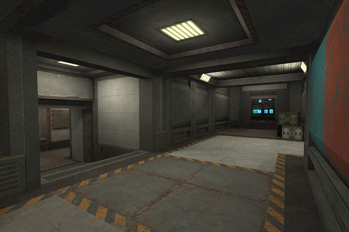
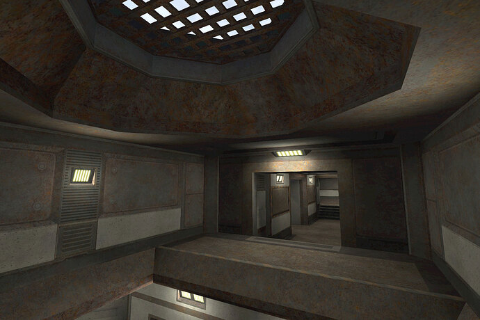
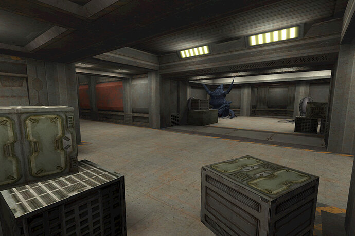
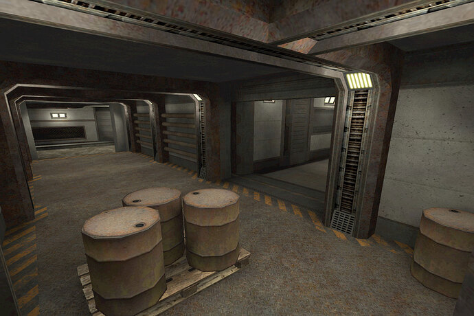
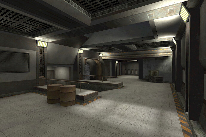
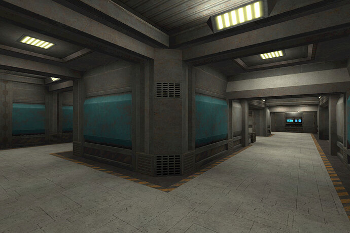
Tight tunnels and few bigger areas of some almost abandoned human facility. It’s a small map and starting base points are not ideal.

SCREENSHOTS


TODO:

  • Optimization of map size
  • Maybe some additional work with a lights
  • More visual details / obstacles
  • Bugfixes? =)
  • Recognizable area names (suggestions are welcomed!)

Changelog:

Beta-1
Initial release

Beta-2
Add: Moar clip brushes!
Add: Wall/ceiling geometry more friendly to aliens
Add: Some color lighting, luminocity changes
Add: Few rooms are bigger now, alien base is tweaked
Add: Minor detailing work
Add: Temporal area names
Fix: Reported texture was replaced
Fix: Removed ‘acid in a barrel’ glitch
Fix: Clipped some areas with ‘broken wallwalk’ zones
Fix: Some textures was re-aligned

General license:
Everyone is allowed to play this map or host it on their server / provide a download link.

[color=#00FF00]Any feedback about gameplay, missing/misaligned textures, not clipped brushes, etc are welcomed.[/color]
5 Likes

First just want to say everything overall looks pretty good!

Note: looks like the krond.ru host site is serving the map’s .pk3 file as plain/text instead of binary… I had to right-click your link and choose ‘Save as…’, otherwise, just clicking the link shows me the enitre file in the browser like a textfile. I mirrored the file here: http://dl.grangerhub.org/files/gh_servers/base/map-rusty-b1.pk3

Here’s some feedback after checking out the map some:

  1. The low ceilings / archways in all of the halls make things seem kinda small and a bit claustrophobic[1]… maybe increase the ceiling height in a few of the bigger rooms?

  2. The lighting is all one color - giving the map a very drab or mono-chromatic look. I wish there was more variety in the light colors to give different rooms different looks/feeling.

  3. The skybox is only visible through the roof in 3 places in the map, it’d be nice to have some windows on the walls in some places, and more skylights to make the map feel more ‘open’.

  4. There’s some issues with wall-walking dretches vs. some of the archways, like this one which stops dretches dead in their tracks:

And these ones are a bit too big, causing dretch’s view to bouce around while climbing over them:

There’s also some problems getting onto the walls (from the floor) and onto the ceiling (from the walls) in this room:

[1] Claustrophobia:

3 Likes

First of all - thanks for quick feedback. I also want say few words about my initial inspiration, it’ll make things more clear. Initial map idea was partially inspired by Pitch Black movie Riddick. Abandoned and dusty small human facility on a distant planet with lack of comfort, etc. Map was initially planned as small one with fast contact with an enemy. I tried keep some ‘balance’ between map geometry detailing and atcs-like ‘straight and flat halls’ gameplay. I’m not so pro at such things, that’s why beta-1 is mostly positioned as ‘gameplay test’. And now more detailed about thing you noticed.

_Note: looks like the krond.ru host site is serving the map’s .pk3 file as plain/text instead of binary…

Strange, I have no such issues in Chrome. This web host isn’t mine, so I can’t do anything about that. I’ll just put your link in my post. Btw, thanks for re-uploading! :smiley:

The low ceilings / archways in all of the halls make things seem kinda small and a bit claustrophobic maybe increase the ceiling height in a few of the bigger rooms?

But that’s human facility, humans don’t need Kong-size ceilings! :rofl: Humans build big spaces for hangars, massive storages, etc. But no point to do so in small facility on a distant planet! :slight_smile: Look at Niveus for example, most hallways there are very small. It have some bigger rooms and huge ladder space, but… I tried to keep backstory and initial purpose in mind.
Actually, there is no much space between rooms to do so. As I noticed before, map initially planned as small, so rooms and hallways are placed close to each other. :frowning: The only rooms where I can do something it’s middle room with ceiling window and a big areas near the default bases. I’ll try do something with it in next version. But don’t expect too much, I’ll try keep things more or less proportional.

The lighting is all one color - giving the map a very drab or mono-chromatic look.

Lighting changes are in my todo list. Right now used only one lamp type, that’s why it looks like so mono. It won’t be like christmas tree lights with wide variety of colors, but some areas will be changed for sure.

The skybox is only visible through the roof in 3 places in the map, it’d be nice to have some windows on the walls in some places, and more skylights to make the map feel more ‘open’.

Map planned as ‘closed’, it’s actually fully placed underground. I used ‘top-only’ skybox because I don’t like low-res mountains and the other same sh*t outside. Which means that windows demand some outdoor decorated unreachable spaces like ones in Transit. So no chances for windows on this map, sorry. :slight_smile: Btw, there is 5 ceiling ‘windows’ on the map, not 3. :wink:

There’s some issues with wall-walking dretches vs. some of the archways, like this one which stops dretches dead in their tracks:

That’s errors, yeah. I definitely missed some areas, it will be fixed in next map version.

There are still many things to work on, but I’d like to do it after some gameplay tests. I looking forward for more opinions and bug reports.

4 Likes

Looking forward to try it.

3 Likes

Better wait a bit, I’m working on Beta-2 version with urgent hotfixes right now. I suppose things will be a lot better than in Beta-1.

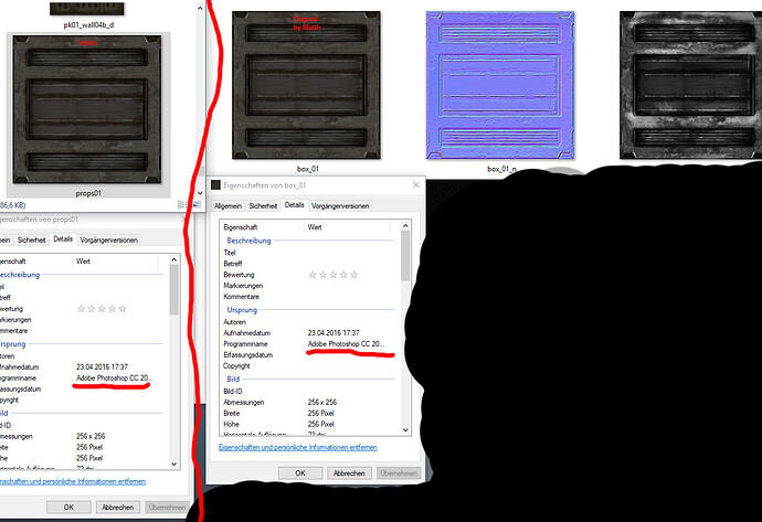
Dude, I’m not claiming any special rights on textures nor selling maps, not making admoney on it, etc. And I’m not thieving anything! -_-’
Just checked, this one texture was in /philipk/ folder from my old laptop. It’s free textures. I suppose there is only one way something wrongly happend - this texture was accidently copyed someday to that folder from one of trem maps. Do you have link to texture source / usage rights? I cant find anything using ‘Matts’ in google. If usage of this texture is prohibited - just say, give links and I’ll replace it with something other. Thanks in advance. :wink:

UPD: I just found out from the Sparky that Matts is you. So it’s yours textures and they are copyrighted? You should have said this at once. :slight_smile: I will remove those textures from map in the next map version.

:sunglasses: great

Beta-2 is out! :smiley:
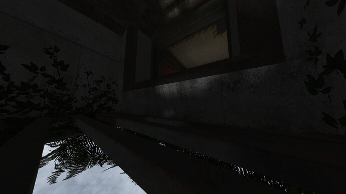
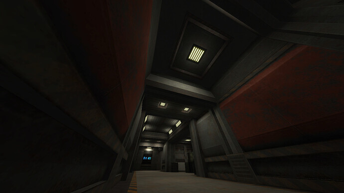
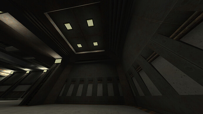
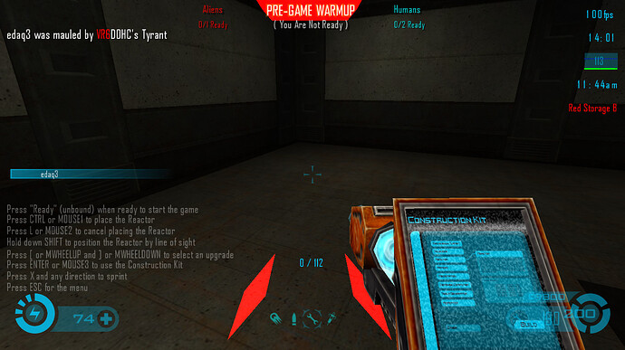
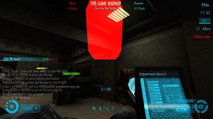
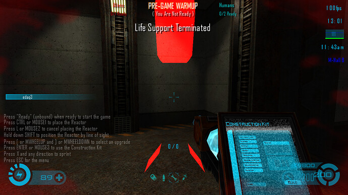
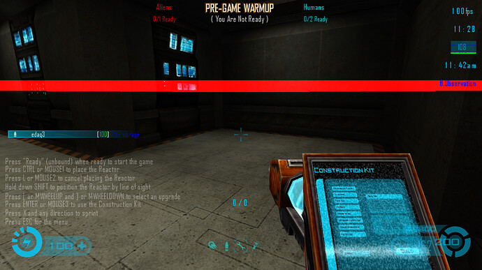
Main post updated. Some screenies:


4 Likes

Mirror at: http://dl.grangerhub.org/files/gh_servers/base/map-rusty-b2.pk3

Note: Your rusty.txt info needs a couple updates for the next version:

The EQ2 texture set by Yves Allaire is licensed CC-BY-SA-4.0.

Source: http://evillair.net/v3/pages/textures/eq2.php

Also, the note about Shaderlab/ydnar’s textures from the Tremulous COPYING file was removed some time ago, so you don’t need to include that bit in your rusty.txt.

2 Likes

Ok, I’ll fix it in the next version. Thank you for your help! :slight_smile:
PS: Download link added to a 1st post.

2 Likes

I planning to update Rusty in a week or so. I saw this map is played from time to time, so… Are there some new suggestions/comments/bug reports? You have some time to post it here so I can possible fix it in next release.
Thanks in advance. :slight_smile:
PS: I remember about palete model bug, this will be fixed.

4 Likes

@CATAHA I think this is a pretty fun map, but there is a lot of room for improvement. My biggest criticism of it is the way it plays- and otherwise it visually looks pretty nice. Here’s some suggested changes, but are just my opinion:

Taller ceilings in some halls - this map might work perfectly for 1.1-style play, but some aspects of 1.3 like the spitfire and marauder , require more room to work with some things. With the way the marauder jumps (now), it feels very cramped if trying to maneuver around to attack (or evade) battle suits, or just when trying to not run into teammates.

Better left/right red/blue distinction. Other than the colors on the walls, it’s too easy to confuse which side of the map you should be on. Perhaps more/unique visual landmarks would help for each side. Ex: red side might have a room with a barrel, blue side would have a crate box there instead (assuming the rooms has been mirrored and has a differently colored counterpart

3 Likes

Ok, i’ll try add more markable details in rooms, but it’ll take some more time. About ceils height… well, it was designed for 1.1, map actually born at 2008, so I don’t think I can improve this moment. But I’ll think about it and gonna look what can I do. Thanks for your response.

3 Likes

I found some areas that have ceilings that are a bit too low to be able to build the reactor there, with the way the 1.3 swirl mode buildable placement works. Otherwise they would been good options in base building. For those particular spots, the ceilings don’t have to be too much higher for the reactor placement to work.

4 Likes

That’s why I told it was too low last week. The roof should higher as general.

But how it works? Can you explain it a bit?
UPD: We’re tested some map moments with Sparky and discovered that it’s strange placement glitch. :slight_smile: